Bala Cranberry Festival
Re-branding Canada’s largest harvest festival
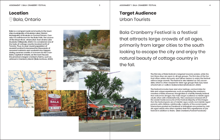
The Bala Cranberry Festival is a 3-day celebration of Muskoka’s beloved cranberry, and is one of Canada’s largest harvest festivals. The festival brings visitors from all over Ontario and offers a wide range of activities from plunging in cranberry marshes to wine tastings. I rebranded the festival to better align with the festivals mission to attract urban visitors and extend the tourist season in Bala.
www.balacranberryfestival.on.ca/
Timeline︎︎︎September–December 2020
Role︎︎︎ Research, Illustration, Brand Strategy
Tools︎︎︎ Adobe Illustrator, InDesign, Photoshop
The Problem
How can I create a brand identity system that showcases the diversity of the festival, while highlighting the hospitality of locals and the interests of the primarily urban audience?
The Solution
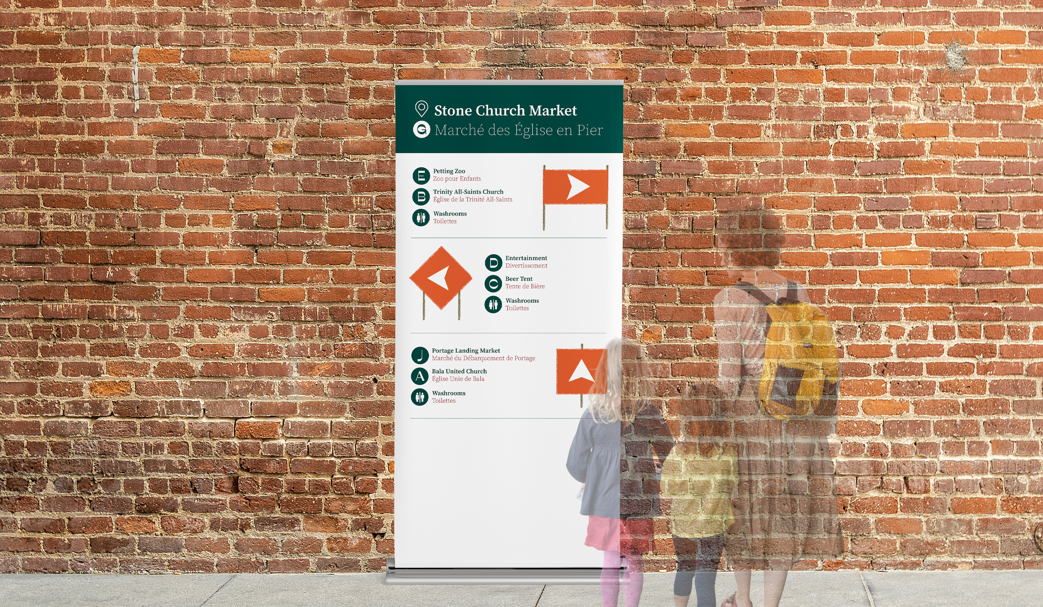
Based on my research, the majority of Bala’s visitors drive to the festival from larger cities to the south. Therefore, the proposed approach highlights the journey to Bala through the depiction of an abstracted map. This approach aims to add value to the journey while still highlighting the festival’s main attraction: cranberries.
Based on my research, the majority of Bala’s visitors drive to the festival from larger cities to the south. Therefore, the proposed approach highlights the journey to Bala through the depiction of an abstracted map. This approach aims to add value to the journey while still highlighting the festival’s main attraction: cranberries.
Visual Style
An earthy colour palette reflects the fall scenery of the festival, while simple, textured illustrations play off of the rustic and playful nature of the festival.

Brand Illustrations
The illustrations highlight landmarks and activities visitors may encounter while driving to the festival. The illustrations prompt a sense of curiosity and promote a wholistic view of the festival.


Process
This project taught me a lot about layout structure and strategy. I have never worked with two languages before, therefore I spent quite a lot of time exploring visual strategies to fit all of my content. Additionally, another challenege I faced was learning how to differentiate each language, and creating consistent typographic treatment across various mediums. While, this project tested both my strategic and visual skills, the re-brand of Bala Cranberry Festival reinforced the importance of flexability within a brand design and the importance of initial research.
Initial Research
To start the project off I compiled a research report that analyzed the festival. The areas foucus included: the festival’s misson, the festival’s audience and its main attractions.
Key Research Findings
a. The festival’s goal is to improve and support the local community
b. Majority of visitors visit the festival from the GTA
c. The wide variety of activities and events attracted a large demographic
![]()
![]()
![]()
Key Research Findings
a. The festival’s goal is to improve and support the local community
b. Majority of visitors visit the festival from the GTA
c. The wide variety of activities and events attracted a large demographic


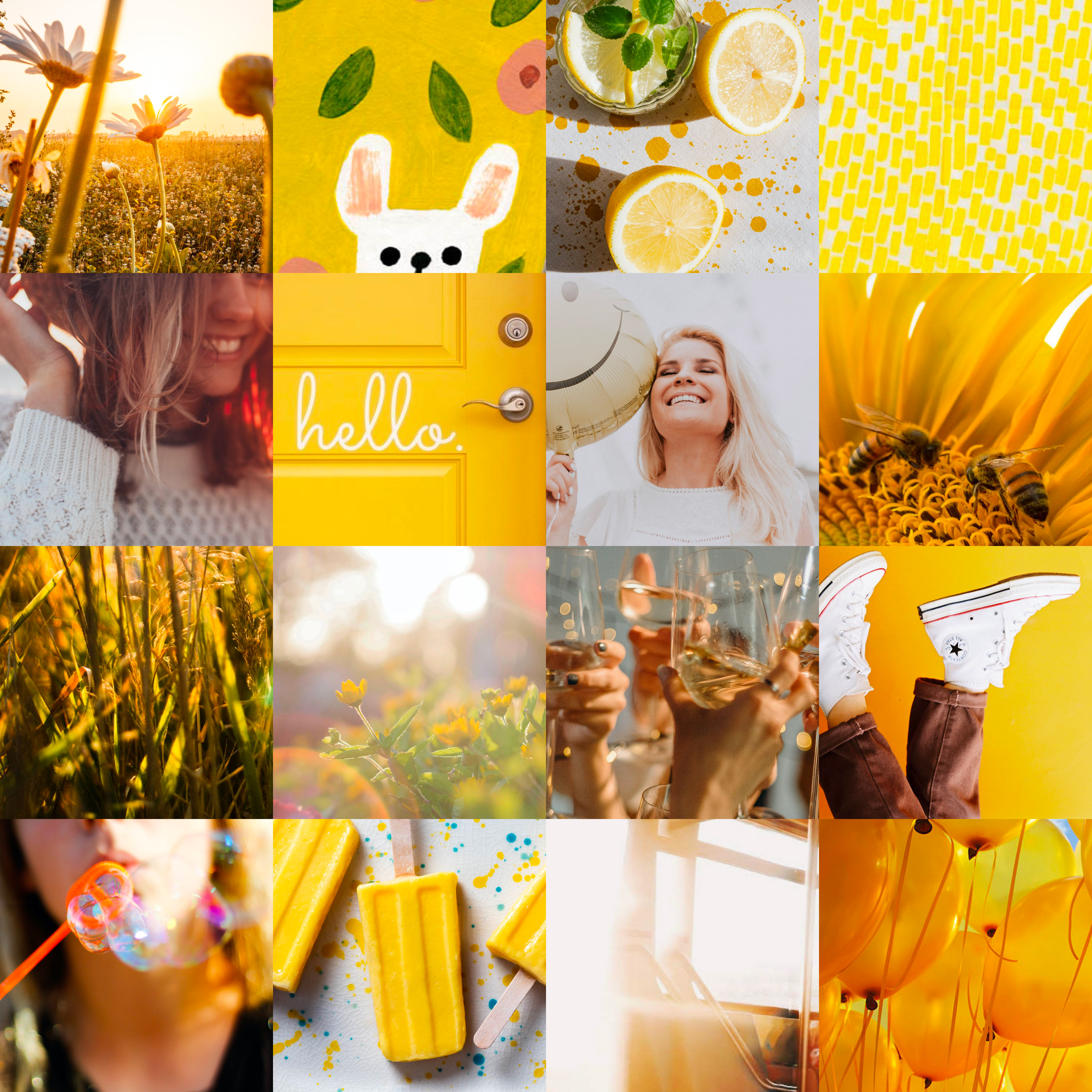
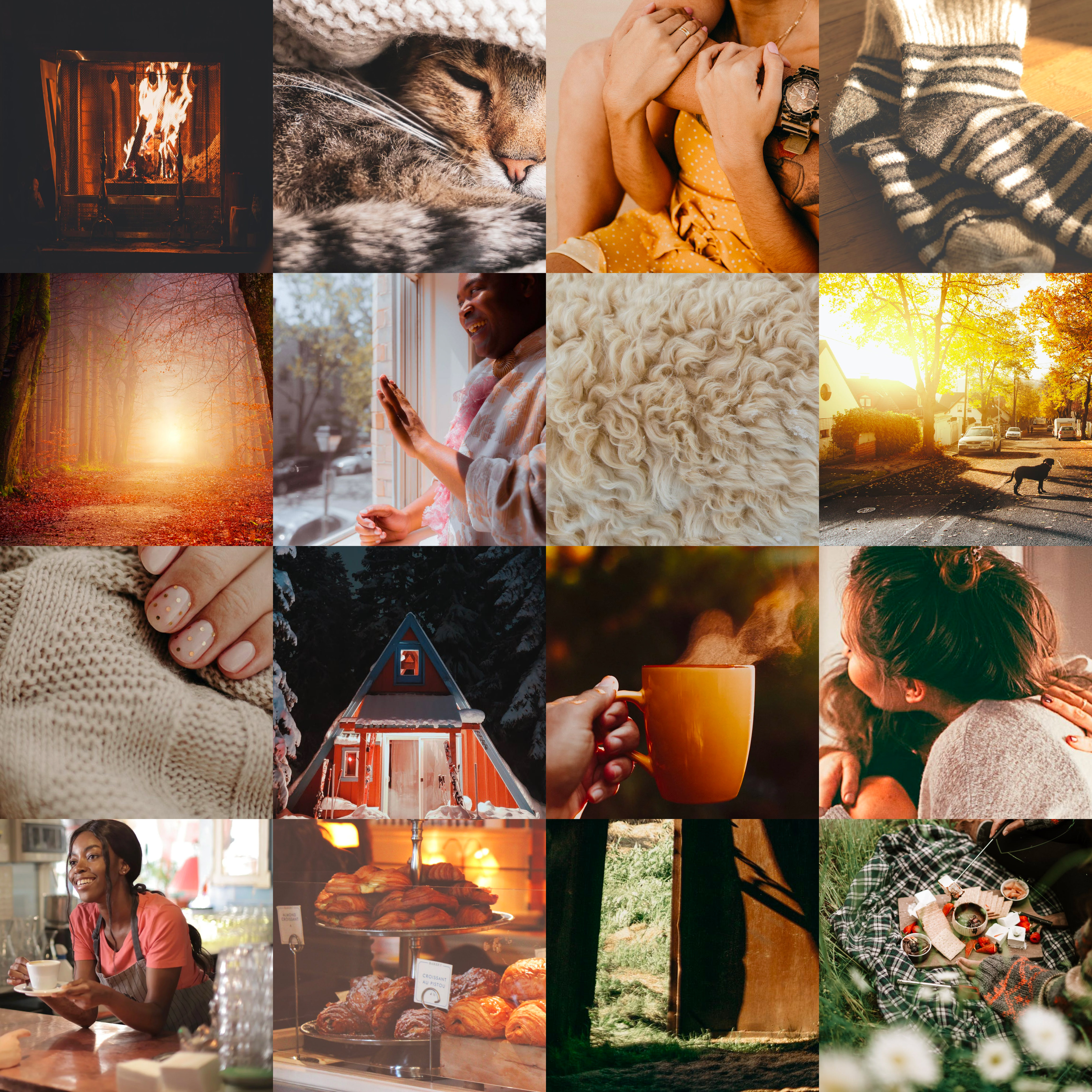
Initial Moodboards
Rustic, Inviting + CheerfulStatement of Intent
Bala Cranberry Festival is a unique festival that allows visitors to embrace local culture and experience the natural beauty and hospitality of cottage country. Through insightful design choices that consider the desires of the festival and its participants, I intent to create a design system that reflects the rustic atmosphere of the event, while highlighting the inviting nature of the locals and overall cheerful attitude of the event.
![]()
![]()
![]()
Bala Cranberry Festival is a unique festival that allows visitors to embrace local culture and experience the natural beauty and hospitality of cottage country. Through insightful design choices that consider the desires of the festival and its participants, I intent to create a design system that reflects the rustic atmosphere of the event, while highlighting the inviting nature of the locals and overall cheerful attitude of the event.

Sketches + Design Sprints
After composing the statement of intent, I started exploring visual solutions for the festival’s poster- the first phase of the project. However, before sketching poster designs I completed two ten minuate design sprints to remove mental block or pre-existing ideas that may hinder my creative. Each sprint focosed on a different visual element. ( I focused on typography and symbolism/illustration). Once, I completed the sprints I moved on to poster and layout sketches.
Initial Visual Explorations
Following my sketches, I created visual inspire boards to help prompt my desired visual outcome.
![]()
![]()
![]()
Initial Visual Explorations
Following my sketches, I created visual inspire boards to help prompt my desired visual outcome.
![]()
![]()
![]()


Initial Visual Explorations
Initial digital explorations based on my sketches. These first iterations explore a variety of approaches and are rooted in the festival’s overall Canadiana feel.
![]()
![]()
![]()
![]()
![]()
![]()
Initial Visual Explorations
Initial digital explorations based on my sketches. These first iterations explore a variety of approaches and are rooted in the festival’s overall Canadiana feel.
![]()
![]()
![]()
![]()
![]()
![]()


Refined Posters
After created a variety of posters, I selected three posters with three distinct approaches– Symbolic, Abstract and Representative. Each poster aims to encapsulate the overall mood of the festival and its key attractions.
![]()
![]()
![]()
Refined Posters
After created a variety of posters, I selected three posters with three distinct approaches– Symbolic, Abstract and Representative. Each poster aims to encapsulate the overall mood of the festival and its key attractions.
![]()
![]()
![]()


Logo + Brand Explorations
While designing the posters, I created bilingual wordmarks that reflected the visual style of each approach.
![]()
![]()
![]()
![]()


