Therefore
Creating a brand identity for YSDN’s graduating class.
YSDN 2021 is the annual event showcasing the graduating students of the York University/Sheridan College Joint Program in Design. Elected by the class of 2021, I helped co-lead a group of 11 students to create the brand identity for there∴fore.
Team Members︎︎︎ Natalie Almosa (Co-Leader, Director of Branding Strategy),
Vanessa Cassar, Tiffany Chau, Selina Chung, Sion Kim, Nicole Lee, Jan Ly, Ashna Ray, Mena Rimac, Hyunan Ryu, Tatiana Terenzio, John Yeon
Timeline︎︎︎September 2021 – April 2021
Role︎︎︎ Research, Brand Strategy
Tools︎︎︎ Adobe Illustrator, Photoshop, Figma
Brand Strategy
The class of 2021 have adapted to many challenges and obstacles, creating a vast range of unique journeys and viewpoints.
YSDN 2021 aims to encapsulate these experiences in the brand, therefore adopting the primary brand values of: Journey, Connection, and Individuality.
The class of 2021 have adapted to many challenges and obstacles, creating a vast range of unique journeys and viewpoints.
YSDN 2021 aims to encapsulate these experiences in the brand, therefore adopting the primary brand values of: Journey, Connection, and Individuality.

Journey
Therefore, meaning “for that reason”, “consequently”, “because of that”, reflects the end of our journey as YSDN students. To represent this concept, we ultilized the name therefore and the therefore symbol, which directly reflects the word itself and the use of threes in our brand (brand values). The word/symbol also lends itself to customizable and brand-conscience copywriting.


Connection
The create consistency and unity while designing our brand remotely, duotone photography was used for student portraits on social media. A dot-like pattern using the therefore symbol represents the connnections students have made throughout their YSDN journey. The pattern is complimented with brand symbols and text.
Individuality
With an online grad show, students were worried that their individuality would be masked behind a screen. Therefore, our team came up with the concept of mark-making using custom Photoshop brushes. Mark-making allowed students to showcase their individuality through the creation of custom doodles or marks. The textured Photoshop brushes also added a print-inspired element to the brand.


Process
Working remotely with my peers in developing the YSDN 2021 brand definately brought some challenges, however through this experience I was able to sharpen my leadership and management skills while creating long-lasting connections.
Requests for Proposal
After executive elections, each student composed a
RFP to pitch their ideas (web, branding + marketing) for the gradshow. Once the RFPs were submitted the branding team went through the proposals and collected common themes found throughout. As a team we discussed the themes and created a Miro board divided into Concepts, Key Words, Visual Identities, and Other Ideas. We used heart emojis to vote on ideas.
![]()
RFP to pitch their ideas (web, branding + marketing) for the gradshow. Once the RFPs were submitted the branding team went through the proposals and collected common themes found throughout. As a team we discussed the themes and created a Miro board divided into Concepts, Key Words, Visual Identities, and Other Ideas. We used heart emojis to vote on ideas.
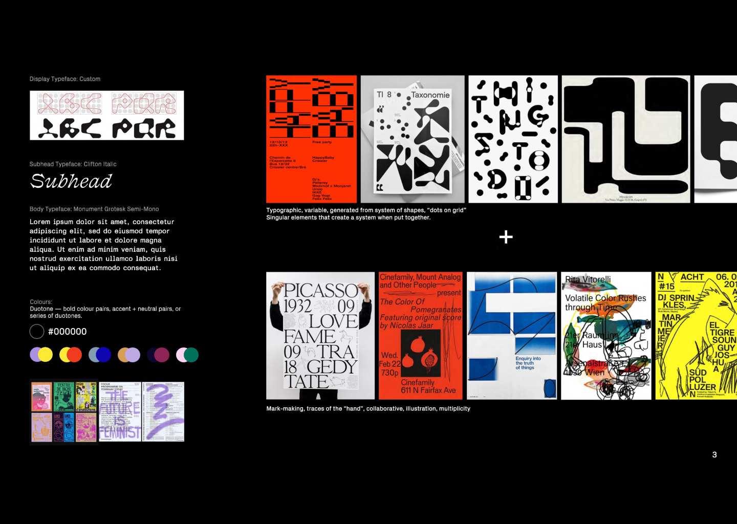
Organizing the concepts into themes
The concepts with the most “likes” were organized into three themes. From these themes we divided into three groups to create moodboards to present to the cohort.
![]()
Moodboards
The three moodboards were presented to the class. Once presented, the branding team put together a survey asking the cohort what they liked/disliked about each visual direction. The survey results were primarily positive, however there wasn’t one clear winner. Therefore, we decided to combine aspects of all three moodboards to ensure the brand represented everyone.
![]()
![]()
![]()
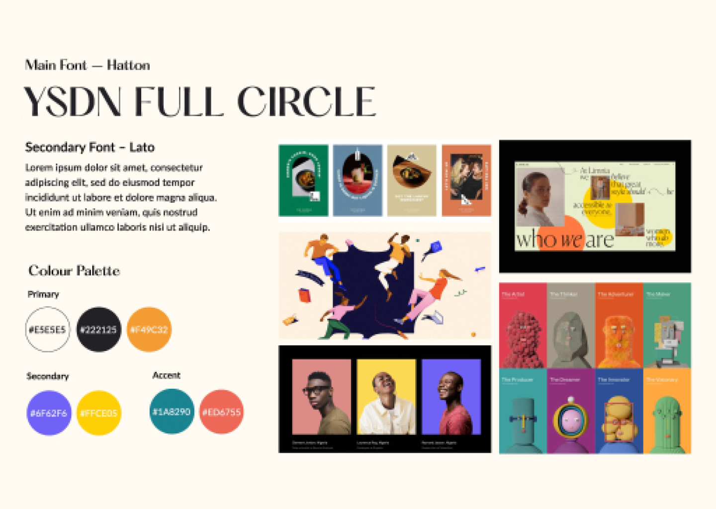
Full Circle︎︎︎
a) Ending YSDN as a community
b) Muted colours, serif type, geometric clipping masks
Introducing︎︎︎
a) Individualism and adaptability as community
b) Mark-making, duotone, geometric/modular type, juxtoposition
YSDN:TO︎︎︎
a) Individual pathways
b) Grid, neon colours, san-serif type

Full Circle︎︎︎
a) Ending YSDN as a community
b) Muted colours, serif type, geometric clipping masks
Introducing︎︎︎
a) Individualism and adaptability as community
b) Mark-making, duotone, geometric/modular type, juxtoposition
YSDN:TO︎︎︎
a) Individual pathways
b) Grid, neon colours, san-serif type
Refining our Strategy
Once we recieved feedback we noticed that while the cohort liked the concepts, visual based opinions varied. Therefore, we decided to synthesize the survey results and focus on a brand strategy that considered key elements from each moodboard. We came up with the branding statement that outlined our brand values and prompt visual exploration.
Brand Statement︎︎︎
The class of 2021 have adapted to many challenges and obstacles, creating a vast range of unique journeys and viewpoints.YSDN 2021 aims to encapsulate these experiences in the brand, therefore adopting the primary brand values of: Journey, Connection, and Individuality.
Determining the Name + Visual Approach
After a few brainstorming sessions our team came up with the name there∴fore. We chose there∴fore, because it represented the conclusive nature of graduation, could be represented in a simple/recognizable symbol and provided a unique opportunity for copywritting. As a result we incorporated personalized therefore statements in our brand (ex. Lindsey∴ Early Bird).
For the visual approach we looked back on the survey and complied a moodboard that combined the cohort likes. From there, Natalie and I assigned the team with a small exercise that involved each group member designing three “social media” posts inspired by the combined moodboard. After discussions and iterations we landed on the final visual identity.
Key Visual Elements︎︎︎a) Use of a bright primary colour palette
b) Mixed san serif and serif
c) Personalized mark-making + 6 brand symbols using custom photoshop brushes
d) Duotone photography
Visual Evolution